


Rebranding for Charity
Homes for the Holidays is a cherished annual event held during the festive Christmas season, recognized the need to update the old logo and underwent a rebrand for charity process to enhance its image and reach a broader audience.

The event brings people together and features a decorated home with multiple rooms transformed by talented local interior designers.
In line with the commitment to making a positive impact, Homes for the Holidays supports the Take a Hike Foundation—an organization dedicated to empowering young individuals through counselling, immersive outdoor experiential learning, and fostering a sense of community.
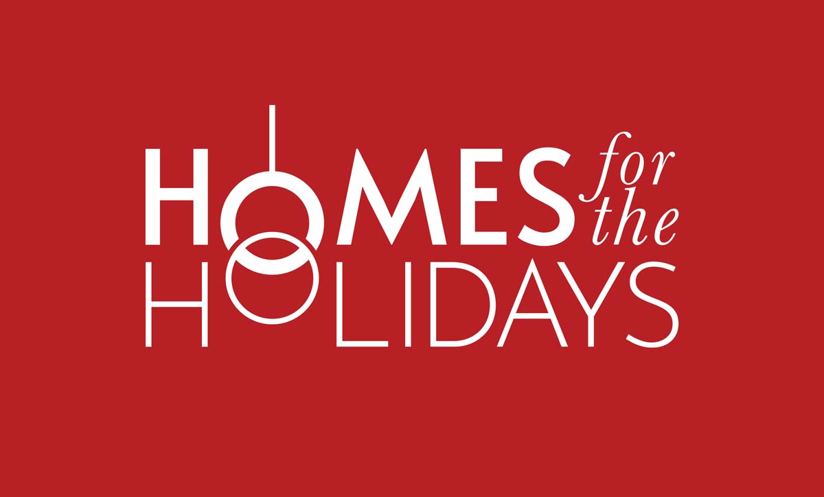
When designing the new Homes for the Holidays logo, our goal was to capture the essence of the holiday spirit while infusing it with a touch of uniqueness. By blending classic fonts and colours with a refreshing twist, we aimed to create a design that stands out amidst the sea of traditional green and red decorative Christmas logos.
![]()
The logo is meant to resonate with both the general public interested in attending and interior designers, as Homes for the Holidays seeks to attract talented individuals who can contribute to their mission.

The central element of the logo, where two «O’s» merge, serves as a symbolic representation. Not only does it evoke the imagery of a Christmas ball ornament, but it also signifies the power of connection, support, and unity. It serves as a reminder of the strong bonds we create when we come together to celebrate the holiday season and make a positive impact on the lives of others.
m
- Date June 6, 2023
- Tags Branding, Graphic Design, Logo Design