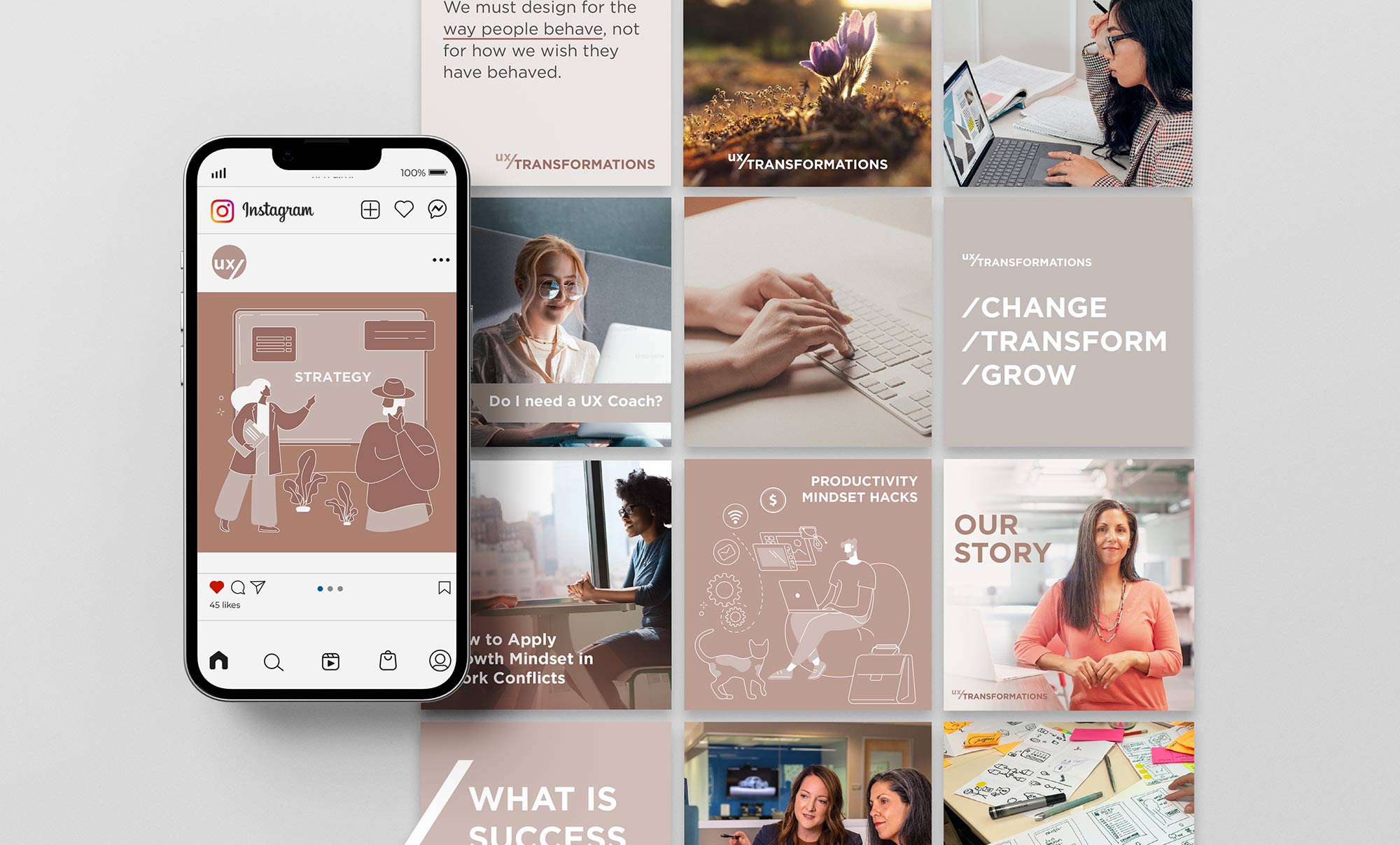
Brand Identity Design for UX Transformations
In the process of creating brand identity for UX Transformations, our primary goal was to design a logo that not only conveys expertise but also evokes an approachable and humble essence.
About UX Transformations
UX Transformations specializes in personalized coaching and mentoring for UX designers aiming to ignite career growth, enhance confidence, and achieve a harmonious work-life balance.
The Brand Identity Wordmark
The wordmark comprises a fusion of two words (UX and TRANSFORMATIONS), presented as a single cohesive entity. The lowercase rendering of «UX» is the beginning of transformation, while «TRANSFORMATIONS» conveys the evolution that follows. The forward slash serves as a symbolic bridge, representing the link between the coach and the learner, as they embark together on the transformative journey.
Logo Colors
The wordmark adopts an earthy color palette, often associated with grounding, humanity and nourishment. The «UX» is delicately rendered in a lighter shade creating depth and contrast in transitioning into bolder and stronger «Transformations».
The Font
The chosen font for UX Transformations is a geometric sans-serif typeface, characterized by its clean and modern lines. This font excels in both legibility and readability, attributed to its generously proportioned x-height.
Key Skills and Tools Applied:
- Brand Strategy
- Graphic Design
- Logo Design
- Social Media Branding and Strategy
- Date January 5, 2024
- Tags Branding, Graphic Design, Logo Design, Pattern Design


