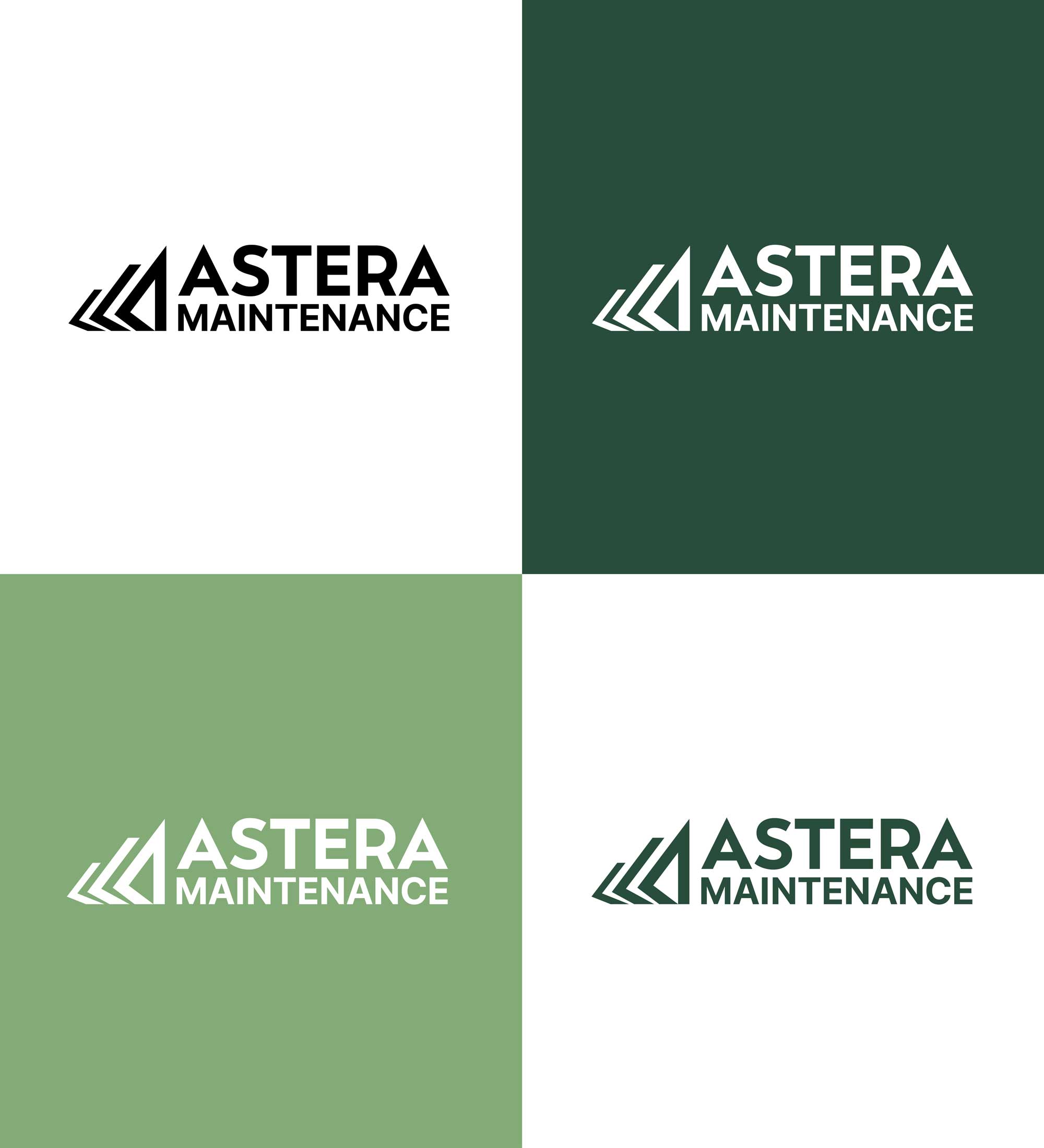
Astera Maintenance Brand Identity
Astera Maintenance is a building and property maintenance company founded in Victoria, BC, now supporting businesses, property managers, and facility teams across Vancouver and the Greater Vancouver area. Their promise is simple: quality maintenance shouldn’t be complicated—solve problems early, communicate clearly, and take ownership of every job.
The challenge
Astera needed a visual identity that felt strong, reliable, and modern—without leaning on overused industry clichés. The brand also needed to speak to a conservative, trust-driven audience (including commercial and military-adjacent clients), while still feeling fresh and distinctive in a competitive market.
The solution
We developed a bold, geometric mark (selected as Logo Option B) that captures Astera’s West Coast values—dedication, integrity, and loyalty—and translates them into a symbol with multiple layers of meaning:
-
Teamwork + growth: interlocking forward forms suggest collaboration and upward momentum.
-
Subtle structure reference: an abstract nod to a house/building shape—without going literal.
-
Built-in recognition: the mark also reads as an “A”, strengthening memorability and versatility across applications.
Typography + brand hierarchy
To balance authority with clarity, we paired a sharp, angular wordmark for “Astera” with a more understated “Maintenance” treatment. This creates clean hierarchy and a professional tone—timeless enough to last, but distinctive enough to own.
Color palette
A deep green system was introduced to communicate stability, trust, and grounded service, with flexible variations for print, apparel, signage, and digital use. The palette supports high legibility on both light and dark backgrounds, ensuring the brand stays consistent across real-world conditions.
Applications + deliverables
The identity was designed to work everywhere Astera shows up—job sites, property offices, and online. Final mockups include:
-
Primary and alternate logo lockups (horizontal/stacked)
-
Standalone icon for social media and small-format branding
-
Business card design
Outcome
Astera’s new brand identity positions them as a dependable maintenance partner—confident, detail-oriented, and built for long-term trust. The new brand system is cohesive, scalable, and ready to grow with the company as they expand across the Greater Vancouver market.
Services: Brand strategy support, logo design, visual identity system, typography pairing, color palette, brand applications, print-ready collateral.
- Date January 12, 2026
- Tags Branding, Graphic Design, Logo Design


